Design & Customization

Style every gallery to your brand

Colours, fonts, corners, captions, hover behaviour — every visual part of a FotoGrids gallery is a control in the panel, not a line of CSS. Set it once, and every gallery on the site follows.

0
Styling controls
In the design panel
0 %
On-brand galleries
Across your entire site
0
Gallery Layouts
Each fully customizable
0
Lines of CSS
No coding required
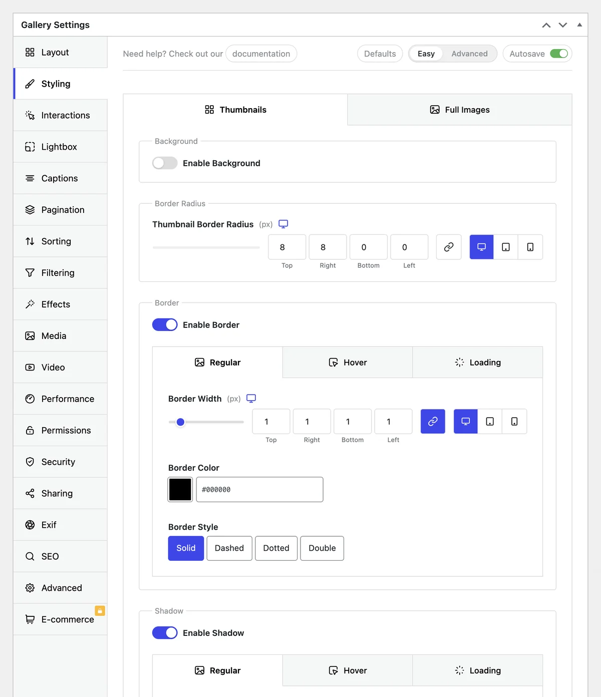
FotoGrids Gallery Settings Styling tab showing thumbnail border radius, border width, colour and style controls
No-code design

Every visual decision is a control

The design panels cover layout, colour, typography, spacing, effects and captions. You move a control, the preview redraws — nothing to save and re-check on the front end.

Color controls

Pick a color for every element — background, caption, overlay, border, hover state — with a normal color picker.

Custom fonts

Titles, descriptions and captions each take their own font, size and weight, so galleries match the rest of the site instead of fighting it.

Borders & corner radius

From hard architectural edges to fully rounded cards, with the same control on thumbnails, the Lightbox and album covers.

Live preview + autosave

Changes render as you make them and save themselves, so a styling pass is one sitting rather than an edit-refresh loop.

Hover & loading effects

Movement is part of the brand too

Hover any tile. Each one demonstrates a different built-in effect from the panel — no add-ons or custom JavaScript required.

A peeled banana set against bubblegum pink.
Border Draw
Draws an animated border around the image.
A watermelon wedge on bright yellow.
Spotlight Pro
Adds a soft halo, gently zooms, and reveals the caption.
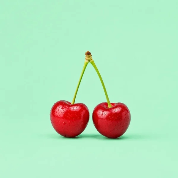
Two cherries sharing a stem on soft teal.
Zoom Pan Blur
Zooms and pans with a subtle focus blur.
A frosted cupcake on bright blue.
Focus Dim
Lifts the tint and zooms the image into focus.
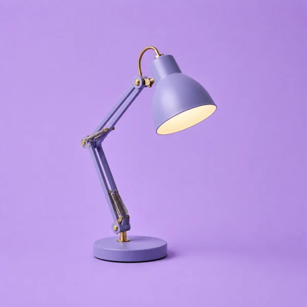
A chrome desk lamp on lavender.
Cinematic Bars
Slides cinematic black bars over the image.
A takeaway coffee cup on sky blue.
Caption Split

Shows the title and description in a staggered sequence.

A glass perfume bottle on pale pink.
Flip

Flips the image horizontally or vertically on hover.

A potted cactus on bright yellow.
Lift
Raises the image with a soft, dimensional shadow.
Image filters

One look, across mixed sources

Photos arrive from different cameras, phones and stock libraries and never quite match. A gallery-level filter pulls them into one mood — and the intensity is a slider, not an all-or-nothing switch.

Grayscale, sepia, blur, brightness...

Applied at the gallery level, so a single change restyles every image in it.

Intensity is adjustable

10% desaturation reads as a house style. 100% reads as a filter. The slider is yours.

Originals are never touched

Filters are display-side. The file in the media library stays exactly as uploaded.

Templates library

Start from a look that already works

Every template is a full style preset — layout, spacing, captions, hover behaviour and colour roles. Apply one, then change the parts you disagree with.

Templates library

A ready-made set covering the common gallery jobs. Apply to a new gallery, or to one you have already built — the images stay, the styling swaps.

Theme templates

Gallery and album templates matched to a theme’s typography and spacing, so each gallery feels natural on the page — not an embed.

Caption styles

Captions carry more than just a title

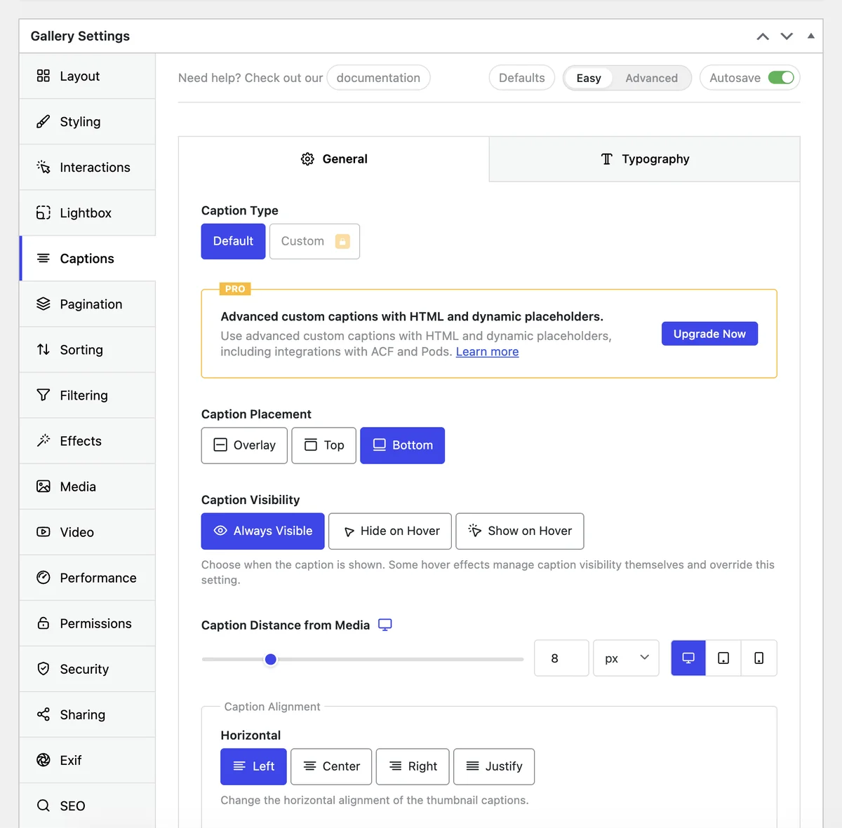
Choose what a caption shows and how it behaves — under the image, over it on hover, or only inside the Lightbox. The fields are yours to pick, including data the image already carries.

Choose the fields

Title, description, tags, people, location, or a dynamic field pulled from the item. A property gallery can show the room name; a print shop can show the edition size.

Below the image, overlaid at the bottom, revealed on hover, or reserved for the Lightbox so the grid stays clean.

Font, size, weight, colour, alignment and background all follow the same controls as the rest of the gallery, so captions match the site’s body text instead of a plugin default.

FotoGrids Gallery Settings Captions tab showing caption type, placement, visibility and alignment controls
One place to change it all

Set the brand once. Every gallery inherits it

Per-gallery controls are fine for one gallery. When there are forty, you want a palette and a type scale that every gallery reads from — change the token, and the whole site moves.

Brand / Primary

#3C46F0

41 galleries
Brand / Accent

#FFB914

41 galleries
Surface / Deep

#1A1A2E

41 galleries
Surface / Base

#EEF0FF

41 galleries
Caption / Heading

Poppins 700 · 18/24

Type scale

Global color palette

Define the brand colors once. Every gallery references the palette instead of a hard-coded hex, so a rebrand is one edit.

Global typography system

Reusable text styles for titles, captions and headings, applied across galleries and albums and consistent as the library grows.

Custom CSS & JS — global or per gallery

When a client wants something the settings do not cover, add it globally for every gallery or scoped, without touching the theme.

White label

Remove FotoGrids branding from the admin experience so the gallery tool reads as part of your own product or client handoff.

Every detail covered

Everything you need to perfect your galleries

And that's only the beginning.

Frequently asked questions

No. Layout, colour, typography, spacing, corners, captions and effects are all controls in the design panel, and they cover the visual decisions most sites need. Custom CSS exists for the cases the panel does not reach, but it is an escape hatch, not the normal path.

Galleries inherit sensible defaults from the site, and you can point captions and headings at your own fonts so they read as part of the page. If your theme has a strong identity, the Pro theme templates are built to sit inside it rather than beside it.

A template replaces the style preset, not the content — your images, order and captions stay. You can apply a template to see it, then keep adjusting from there, since every value it sets is still a normal control.

Yes. Every control is per gallery by default. The global palette and type system exist for when you want the opposite — one visual language across everything — and a gallery can still override a token where it needs to.

No. Filters are applied on display. The uploaded file in the media library is untouched, so you can change or remove a filter at any point without re-uploading anything.

The styling lives with the gallery, not with the builder. The Elementor widget, Divi module, Gutenberg block and shortcode all render the same gallery with the same design settings.