

Visual stories built for the way bloggers actually publish
From camera roll to captivating post
Designed for stories, not just galleries
Fast on every screen
Make every grid your own
Save formats you can reuse
Keep readers inside the story
Find every image again

















Choose the layout your stories deserve
Grid
Masonry
Justified Rows
Slider
Image Viewer
Single Item
Featured Item
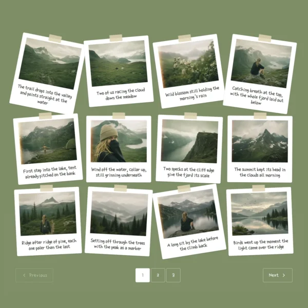
Instant Photos
Publish more. Tinker less
Drop in your images
Shape the story
Optimize and publish
Add alt text, links, and sharing details from one screen – then publish a fast, search-ready story.
30+ professionally designed templates. Yours in two clicks


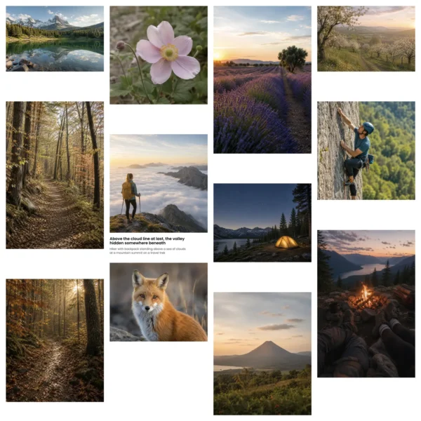
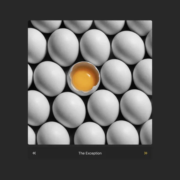

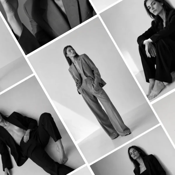
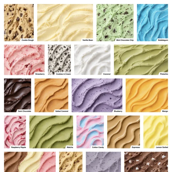
Curated for real blogging workflows
Choose templates by purpose - travel diary, recipe, tutorial, roundup, review, or photo essay - not vague design names.
Live preview with your own content
See each template using your actual images and captions before applying it. Know exactly how the finished post will look on your site.
Make every template your own
Adjust spacing, colors, hover effects, captions, and overlays from one simple panel.
Save your own as reusable templates
Perfect one post format, save it, and reuse it as a polished starting point for future stories and recurring content.
One plugin. Every visual story
- 8 pixel-perfect layouts
- Fully responsive
- Grid, Masonry, Justified, Slider, Image Viewer, Single Item, Featured Item, Instant Photos
- 30+ premium templates
- Automatic theme inheritance
- Custom colours, fonts & spacing
- Advanced hover effects
- Reusable gallery templates Pro
-
4 additional layouts:
Mixed Tiles, Carousel, Video Playlist & Product Gallery Pro
- Captioned tiles & lightbox
- CTA overlays per image
- Hover-to-reveal info bar
- Sorting & filtering, no code
- Tags, categories & collections
- Clean structured markup
- Core Web Vitals friendly
- Editorial & visual-story templates Pro
- Comments, ratings & reviews Pro
- Per-image engagement scores Pro
- Visitor attribution per gallery Pro
- Tracked CTAs into GA4 Pro
- Lazy-loading & built-in caching
- Responsive images, every device
- Captions, alt-text & basic SEO fields
- Social sharing built in
- Watermarking & right-click protection
- Page builder integrations
- Visual drag-n-drop builder
- Autosave & live preview
- Gallery migration assistant
- Image SEO & structured data Pro
- AI-powered alt text & meta Pro
- Automatic image optimization Pro
Frequently Asked Questions
Can I add FotoGrids galleries to existing blog posts?
Yes. You can add a new gallery to an existing post without rebuilding the rest of the page. Choose a layout, select your images, and place the gallery wherever it fits naturally in the story.
Will FotoGrids work with my WordPress theme?
FotoGrids is designed to inherit your theme’s typography and colors automatically. You can keep those defaults or customize each gallery’s spacing, colors, captions, and effects.
Are the galleries mobile-friendly?
Yes. Every layout adapts to different screen sizes so images remain clear, balanced, and easy to browse on phones, tablets, and desktop computers.
Will image-heavy galleries slow down my blog?
FotoGrids uses responsive image sizes and lazy loading so visitors download only the images they need. This helps image-rich posts remain fast and comfortable to browse.
Can I add captions, links, and alt text?
Yes. Images can include captions, alternative text, metadata, and clickable calls to action. This gives readers more context while supporting accessibility, search visibility, and engagement.
Can I change layouts after publishing?
Yes. You can switch layouts without uploading your images again. Image order, captions, links, and metadata stay attached while you explore a different presentation.
Can I reuse the same design across different posts?
Yes. Once you have styled a gallery, you can save it as a reusable template. This keeps your blog visually consistent and makes future posts much faster to create.
Do I need to know how to code?
No. FotoGrids includes a visual editor and live preview, so you can build and customize galleries without writing CSS or editing your theme files.